
Project information
- Category: UI/UX
- Client: Oak Internal
- Project date: February 2022
Project Overview
I understook some exploratory work to show how Oak could look with some improvements to the UI. This was primarily focused on a feature called 'Universal Create', as well as incorporating some improvements due to some user issues.
My Contributions
I was the primary designer on the project so the vast majority of work for this project was created by myself. I contributed to research, user flows and final UI designs.
Research & Ideation
After receiving a brief around the 'Universal Create' feature, which was to be a simple way for users to create a post or content within the Oak platform, I conducted some research around other social media sites and how they're process for creating content worked. This involved looking at Twitter, Facebook, Reddit as well as Instagram. The vast majority of these sites allowed you to create a post from anywhere within the site/app by selecting the relevant option from a menu. However, Twitter allowed you to create a post with one click/tap, which is the simplicity that I was after for 'Universal Create'. Reddit also allowed users to select the location where their post would appear which was something would benefit this feature in Oak.
The Design
I first began to look at the main menu bar to include the Create icon, however, this would require streamlining as there were already 5 icons in there, as well as a User Profile image. Following conversations around this, it was decided to drop the icon for Knowledge Base to a different submenu.
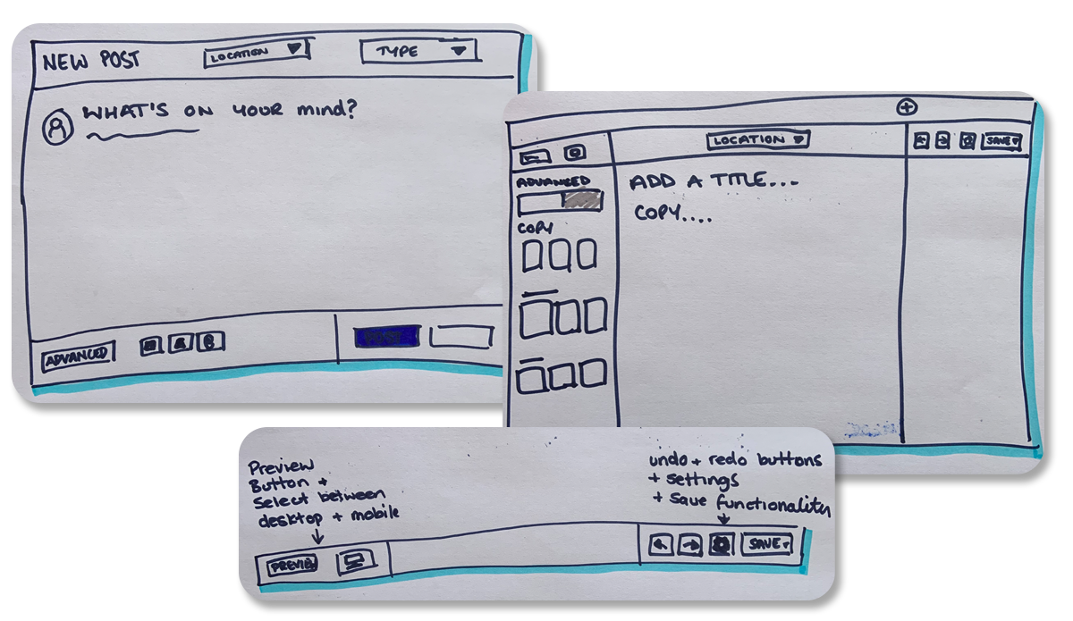
I then looked at what I called the Toolbar, this would include a page preview, the location the content was to be saved, as well as undo, redo, settings and save options. The Toolbar was quite an important feature, as there had been plans on the product roadmap to include a number of features such as page preview but there had been difficulties in finding the best location for this to be. The undo & redo buttons also served a bigger purpose as there had been feedback that users had accidently deleted applets when building homepages and there was no way to rectify this. The initial thought was a two-step delete process, but this was met with opposition from some as it took away the instant delete. I felt the Undo button was the simplest solution to this problem and meant that elements could still be deleted with one click.
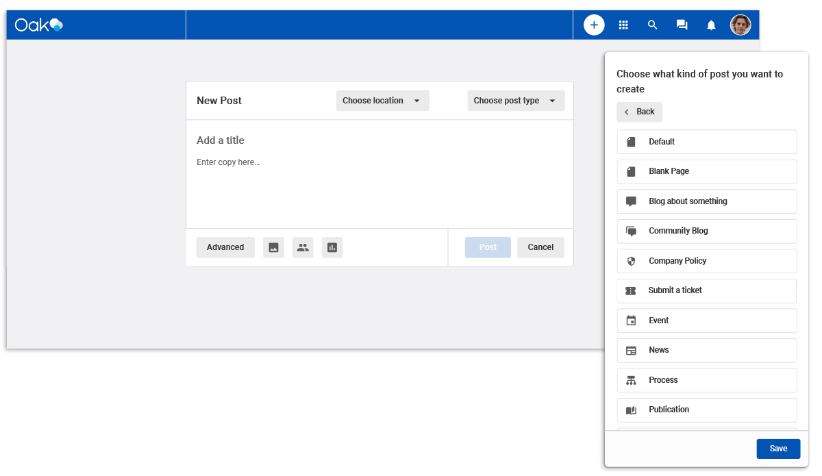
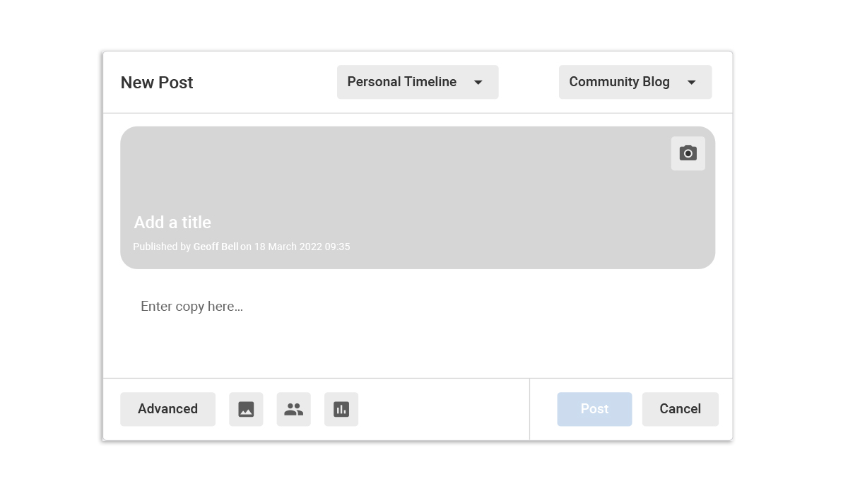
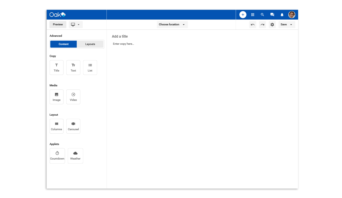
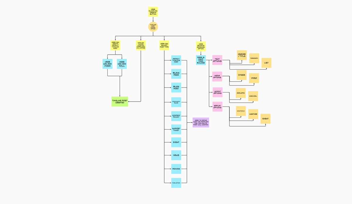
Simplicity was at the heart of my vision with 1-click create the main driver. Users could click the Create icon and be given a modal that allowed them to create a post for their social feed, but they could also create content such as News or Events by selecting the relevant option. Choosing the post type would populate the modal with a basic template for that type of content, and the user could go one step further by clicking on the Advanced button to be taken to a drag and drop editor where they could have the ultimate freedom to create the page they wanted to making content as simple or as advanced as the user wanted.
Feedback & learnings
I enjoyed working on this vision of how Oak could look, however it was ultimately deemed to not be a viable option and work was started on a more stripped-back version of the social post modal with some elements of my original design used.